TU Delft, course Usability and User eXperience Assessment in Design 2020
Client: Miele
Group project, 4 people
How should the coffee maker be redesigned in order to have a better user experience?
The goal of this course was to analyse the product thouroughly, and come up with a redesign for better usability. This redesign should then undergo a carefully planned and structured user test in order to decide whether the new design was good, and where it could still be improved. The challenge within all of this was to not design a completely new machine, but stay as close to the original machine (and technology) as possible, while maximizing improvement. To see the final result press the button below the image, for the entire process, keep reading!

The process

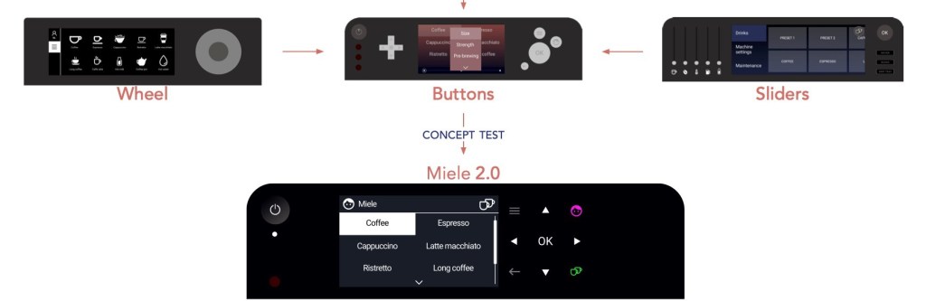
Firstly the existing machine was evaluated through several different method. A design brief including problem statement was generated through these insights. Three rich and diversing alternative concepts were developed, which were compared and tested in a concept evaluation test. A converged interface, the 2.0 version, was then put through a formal usability test, and from this a version 2.1 and further recommendations were formulated.
Analysing the original machine
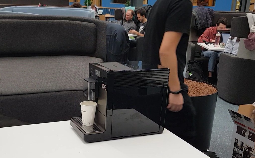
The product guru’s perspective 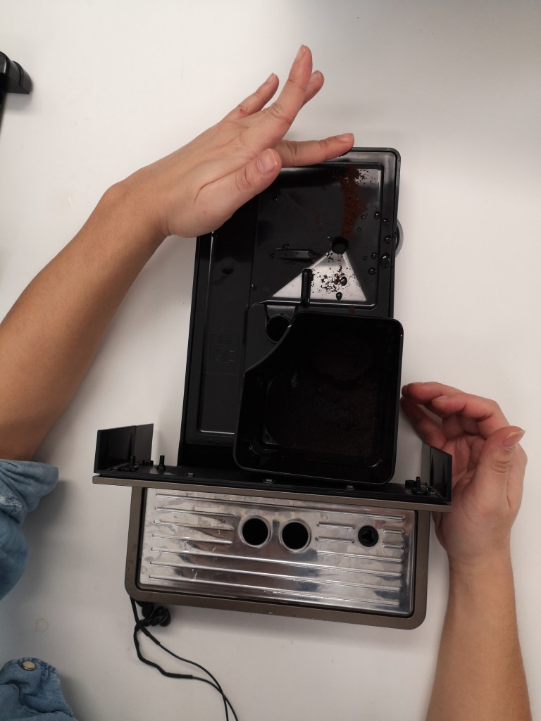
Using it from a designer’s point of view 
Cognitive walkthrough
Using several methods, such as perspective based inspections, cognitive walkthroughs and mapping out the machine, as well as general use with a designer’s perspective, we found 66 different problems with the machine. These problems ranged from minor annoyances to absolute showstoppers. These problems went through an analyis process, to come up with a design brief, including a problem statement.
The design brief
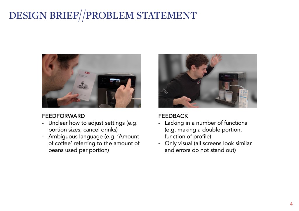
The problem statement:
Currently the coffee machine does not adequately guide the user through the process of making a coffee drink. This results in many moments of confusion, undesired surprises and even startling events. The product analysis revealed problems in two categories: feedforward and feedback. Feedforward refers to product elements that inform the user what functions are available and how to use them. Feedback refers to the information communicated after an interaction to confirm that the user did the correct action and is making progress towards their goal.
What is missing? 
What do we want? 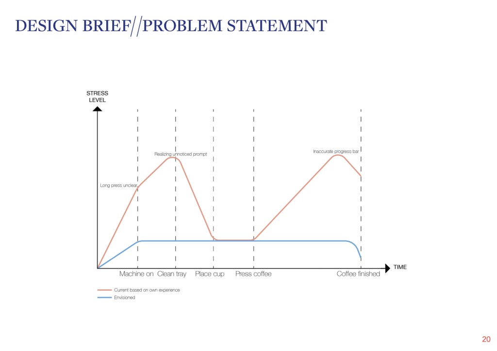
Current vs. desired experience
Concepts
From here three concepts were generated, that distinctly differed from one another. The goal here was to tackle some of the problems we found, try to improve them and learn what did and did not work. The three concepts were then also compared to the qualities in the design vision.
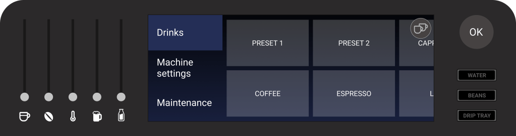


This concept evaluation was thouroughly analysed and insights were gathered. These would work as guidelines for our coffeemachine version 2.0. Furthermore, they helped us decide on a design strategy, we would use the concept with red as a base, while adding all the best parts from the other concepts to it. For example the high contrast or good overview were things users valued, and we wanted to implement in our design. Furthermore, we attempted to get (technology-wise) as close as possible to the original machine, using only a screen and touchkeys.
Formal Usability test
Due to COVID-19 we could not really built a prototype to test in context, as we could not come close to all participants. We therefore designed a test that could be done remotely, but we had one person present there whenever possible, to take away the stress of making all the technology work. Since we had a flat display with touchkeys, this could be replicated by an ipad, which we put on a stand to reach the correct ergonomical height.

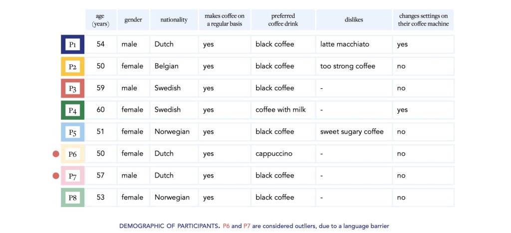
A formal test protocol was written and executed. The test consisted of 3 parts, getting to know the machine, exploring the settings and a final usability task. In total participants performed 9 tasks, and reported on them after each task and after the part was finished. Due to our remote protocol we were even able to recruit participants from a wide variety of countries.
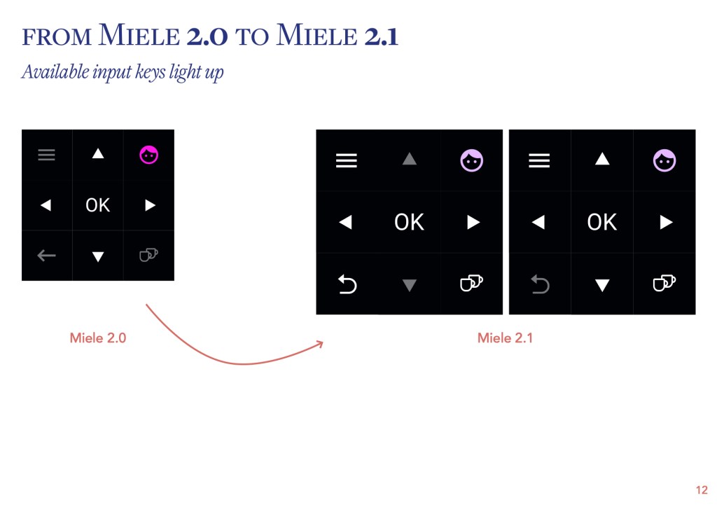
In the analysis afterwards we concluded which tasks had high succes rates, where in the process the users felt uncertainty, how much they felt like a product guru and how the machine matched against the goals set in the design brief. Along with their general comments, this helped us shape the redesign of the 2.0 into the 2.1 version.


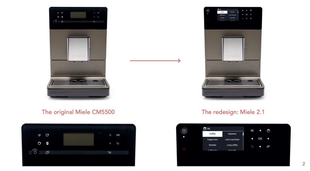
The Miele 2.1
This was the final design proposed and discussed with Miele. Staying as close to the original machine as possible, while at the same time improving usability and user experience. Focus of the redesign process has been improving feedback and feedforward, making the machine more consistent and the user feel more in control. Essentially making them feel like a product guru.
First you can see what the Miele 2.1 actually looks like. and how it is different from the original machine. Further on it is explained how the 2.1 evolved out of the 2.1, which was based on our usability test.


Let’s create something wonderful together.
